Role
UX/UI Designer
Industry
E-commerce
Duration
3 months
This project was conducted through the Google online UX course through Coursera. It was a random selection from a design problem generator.
Cake ordering is inefficient in a world that experiences shifts in ordering behaviour, changing from in-person to online. An ordering system for a cake shop should be moving with the times too and making it more convenient for customers to access.
Designing an efficient way to order cakes online from a bakery.
Conducting user research, wireframing, sketches, and Low-fi and High-fidelity prototypes.
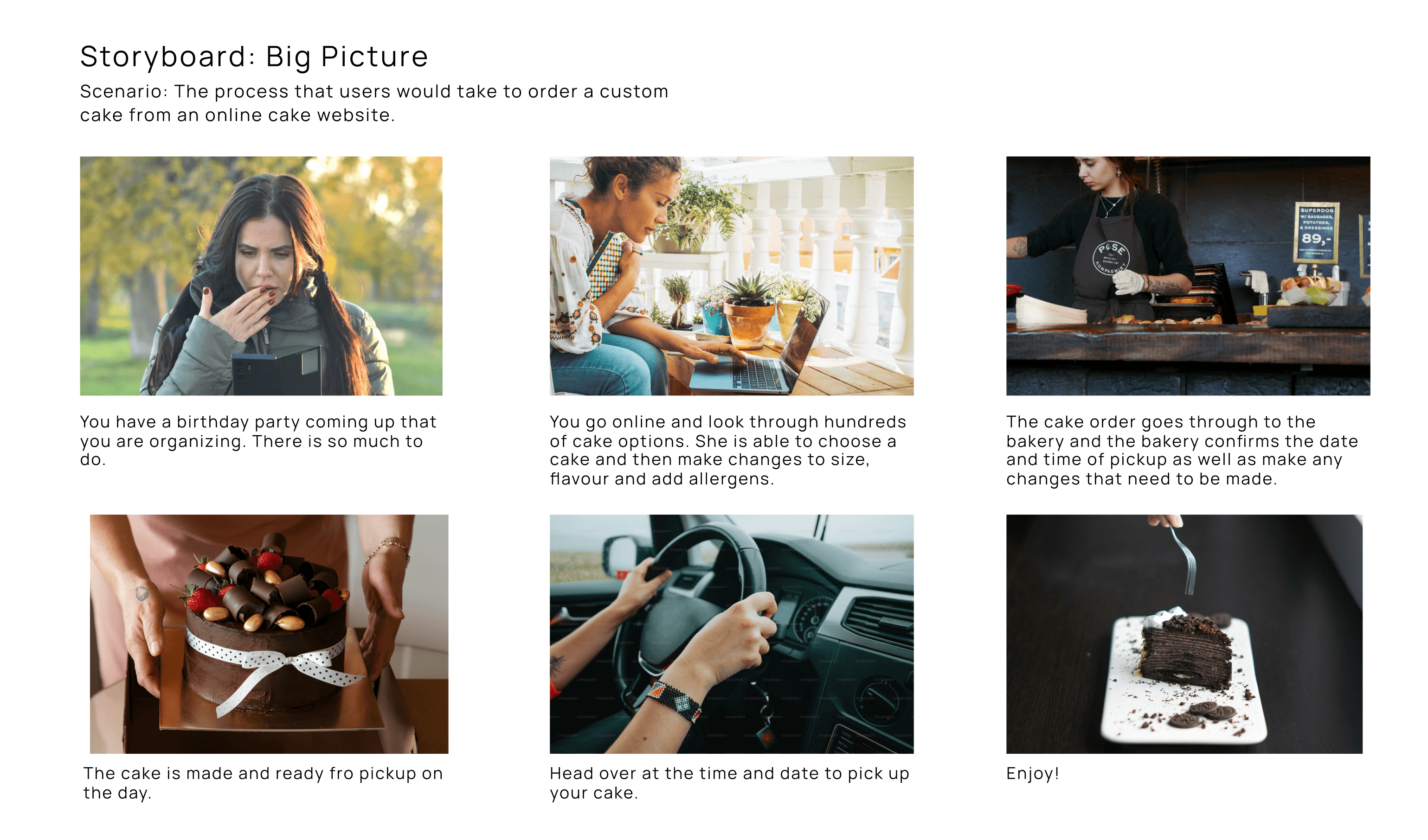
I created a storyboard in order to walk through the path that the potential users of this app will go through while using it. This storyboard highlighted key pain points and areas of improvement.
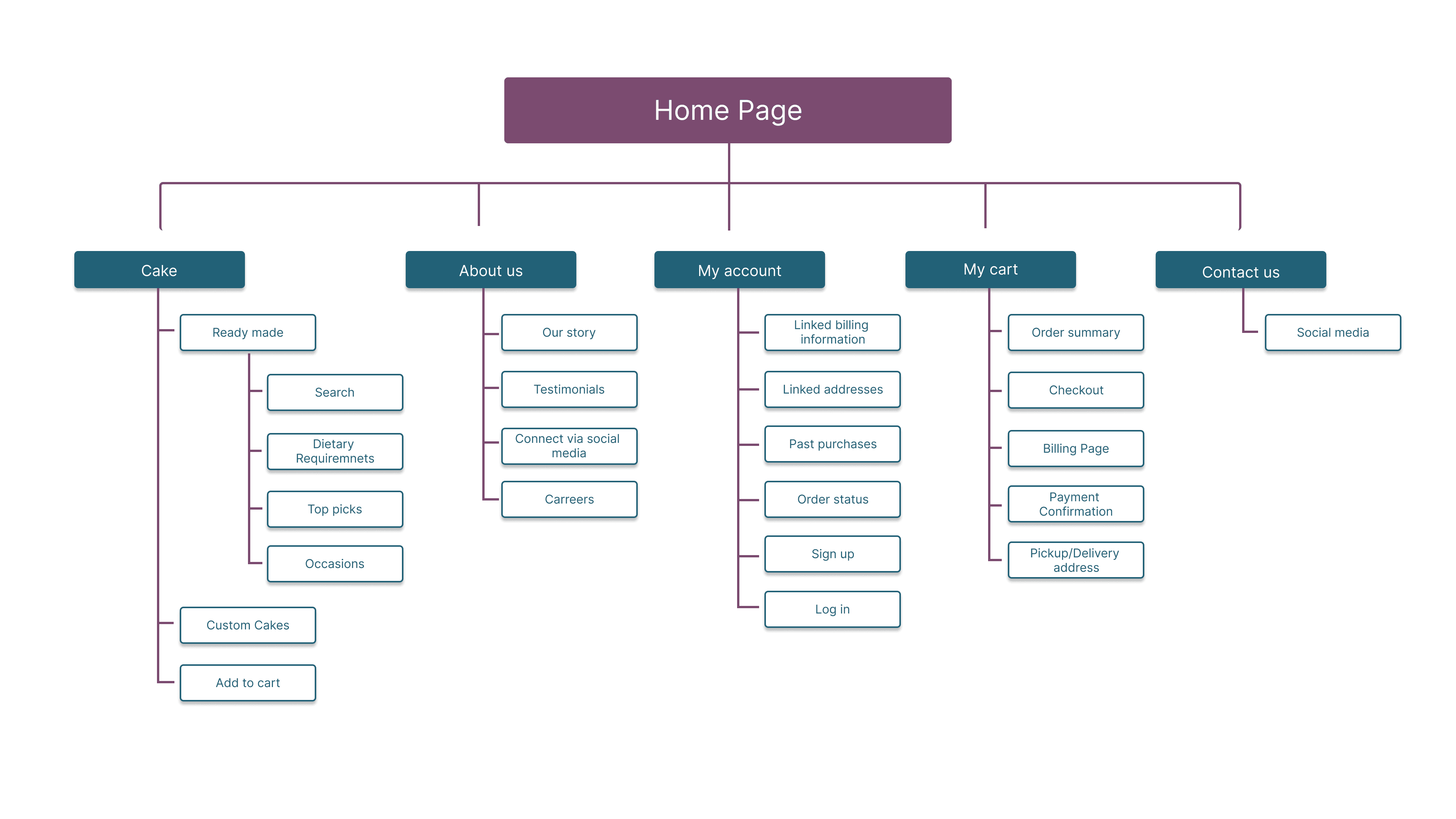
My goal here to make simple yet effective and intuitive information architecture that users are able to move through effectively.
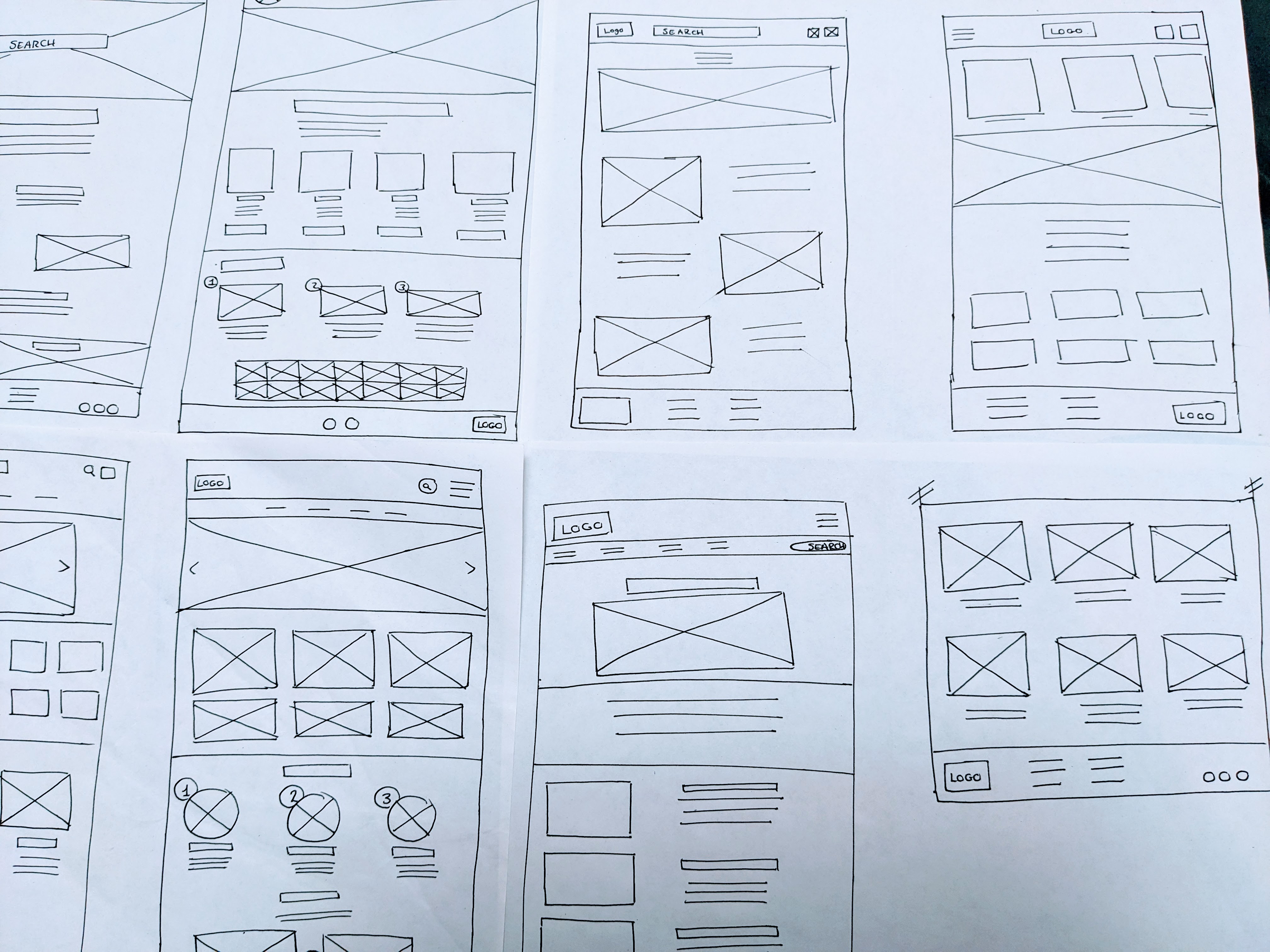
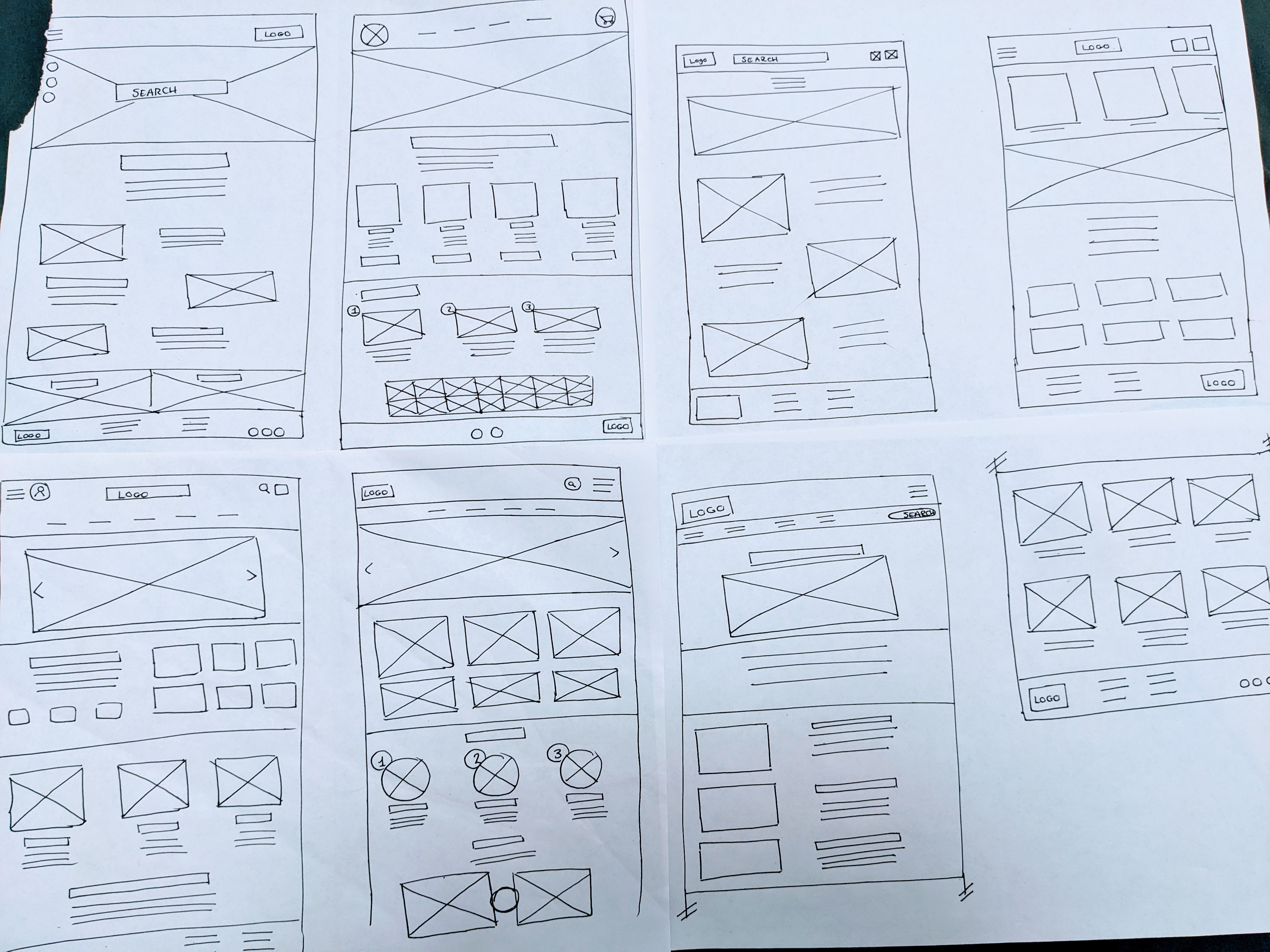
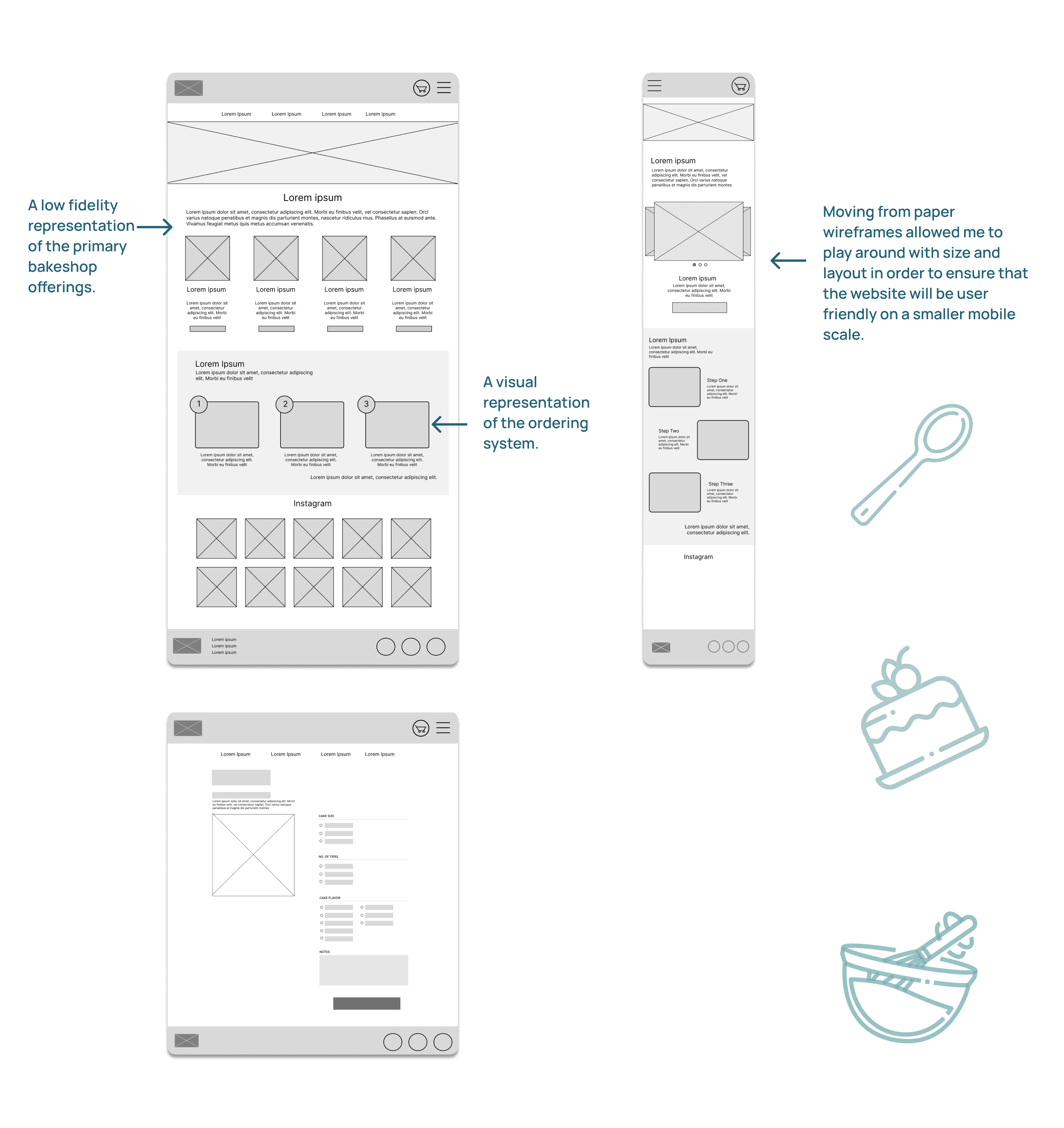
To begin the wire-framing process, I drew up some wireframes by hand. This process allowed me to come up with many ideas quickly, that When I started the wire-framing process, I began by sketching out some initial wireframes by hand. This method enabled me to generate numerous ideas rapidly, and it allowed for easy modifications and redesigns. After creating a few hand-drawn wireframes, I identified the essential elements that I wanted to incorporate into the digital wireframes. Subsequently, I transitioned to Figma and produced a low-fidelity prototype for the Cakey website. This phase involved conducting some research into existing cake ordering websites. be easily changed and redesigned. Once I had a couple of these hand-drawn wireframes, I highlighted key elements that I wanted to include in the digital wireframes. I then went into Figma and drew up low Fidelity prototype of the Stof app.
This process required doing a bit of research into current fashion e-commerce sites and resale sites to establish current trends and best practices. This also allowed me to see what the basic limitations of e-commerce sights.
Paper Wireframes
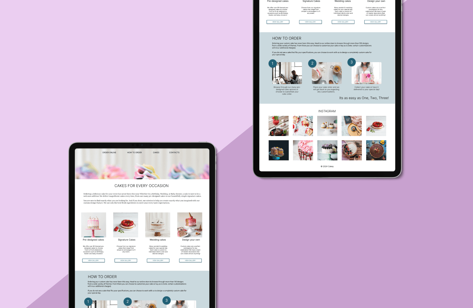
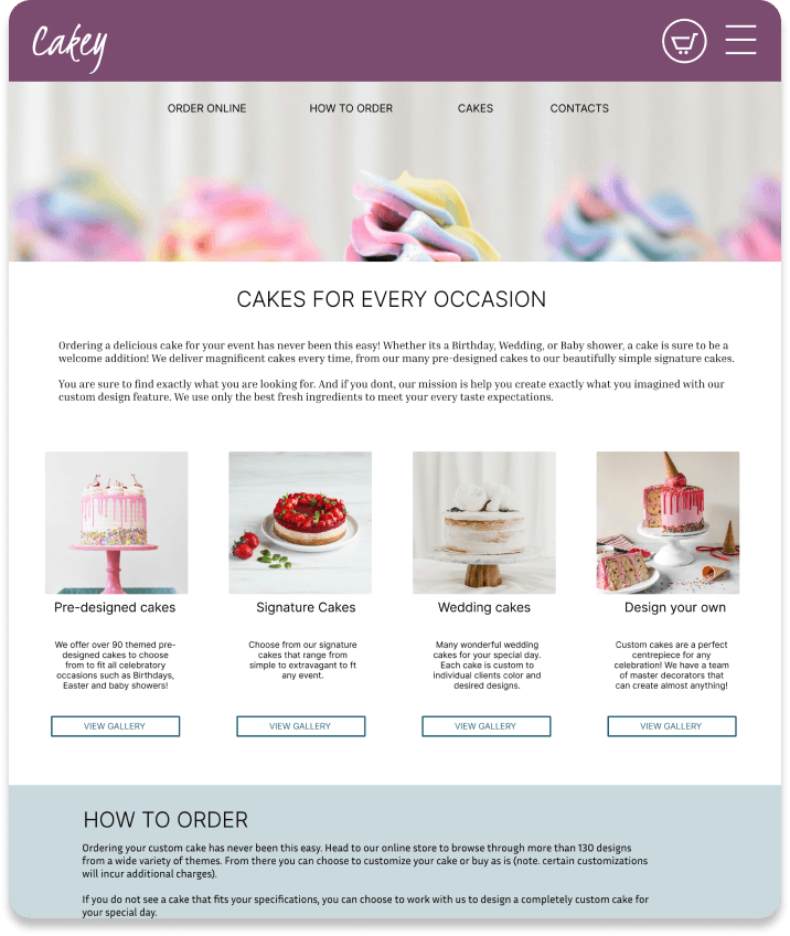
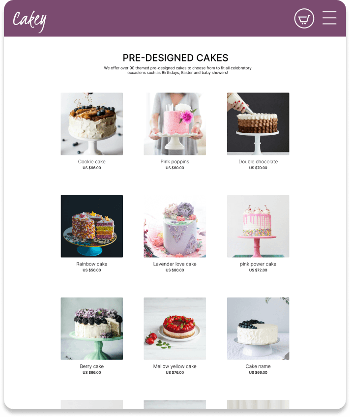
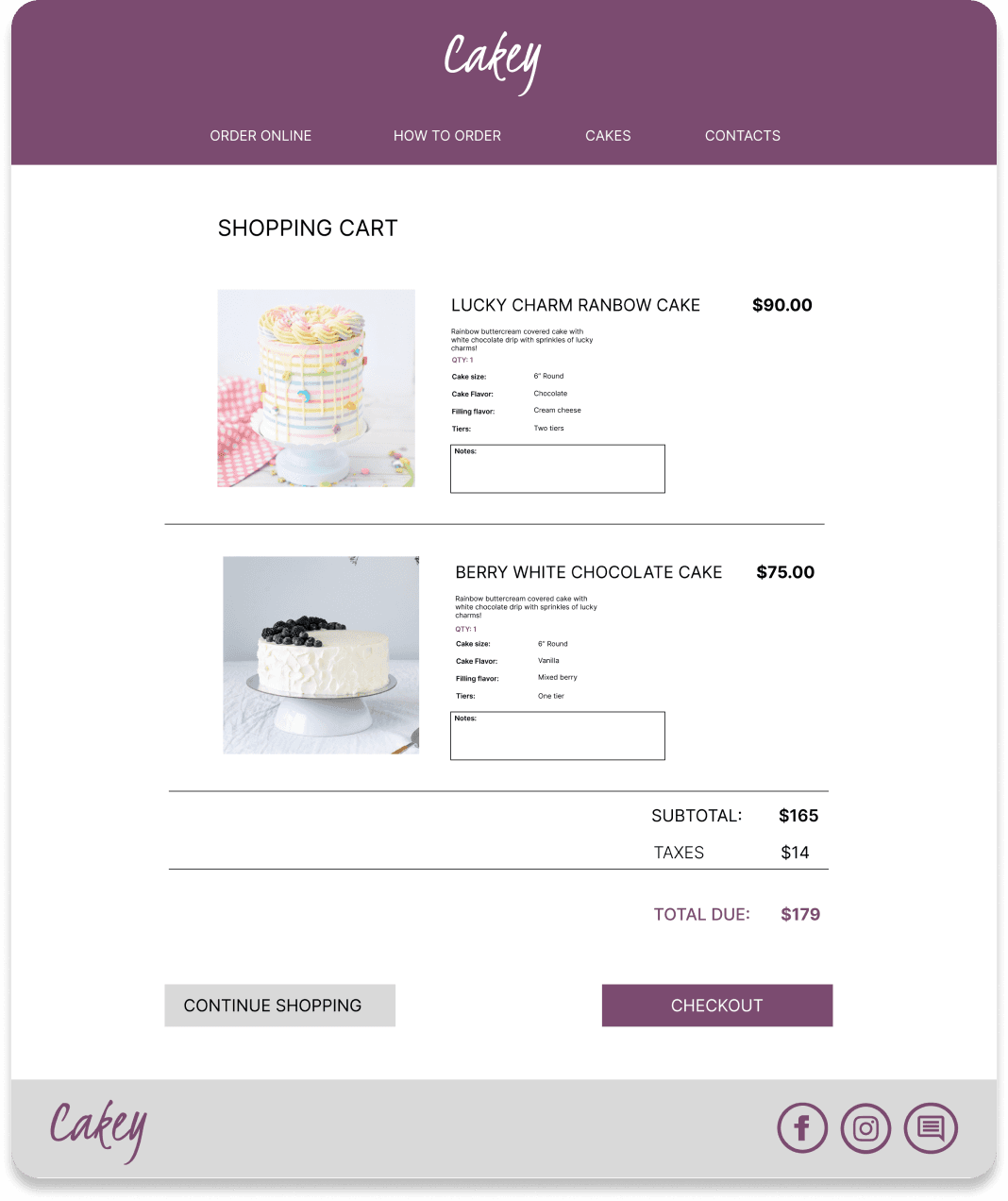
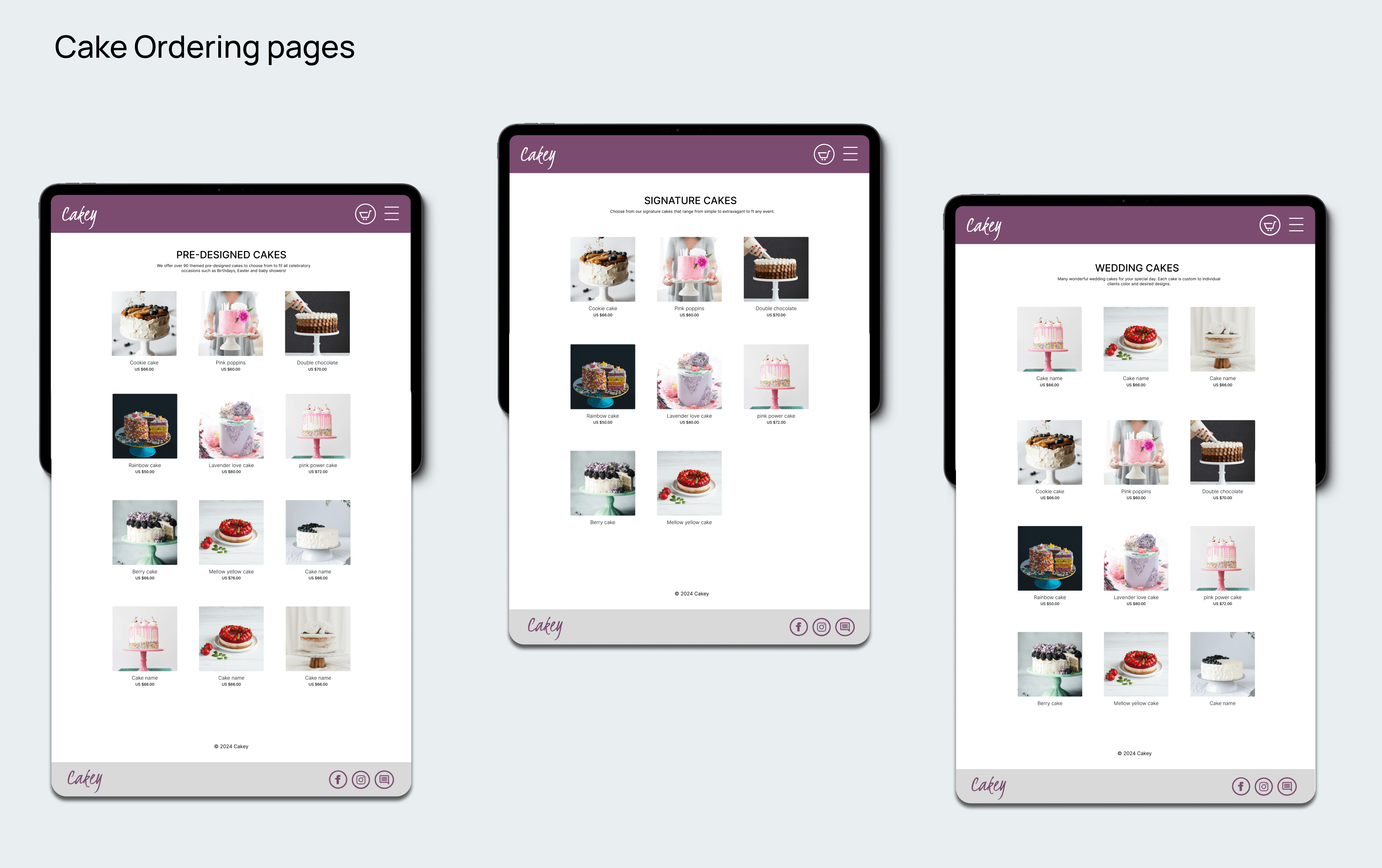
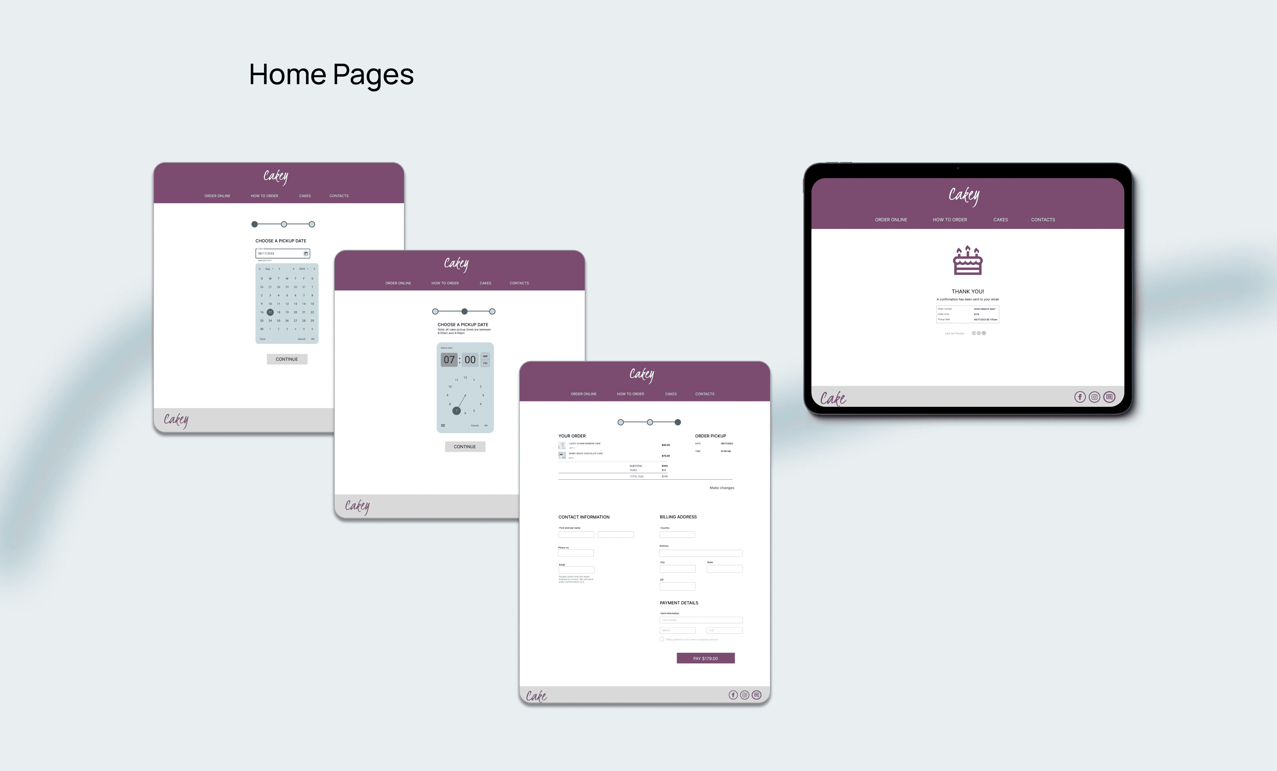
I moved from paper to digital wireframes and this allowed me to play around with size, and space. It allowed me to move around the placement of action buttons and focus on what the website will look like.
Digital wireframes
I moved from paper to digital wireframes and this allowed me to play around with size, and space. It allowed me to move around the placement of action buttons and focus on what the website will look like.
Usabilities studies where conducted with Seven potential users with the initial low-fidelity wireframes, fonts, colours and call to action buttons. Users where able to ‘play around’ with the Low--fi prototype while they spoke out loud about what they were doing and any roadblock they came across.
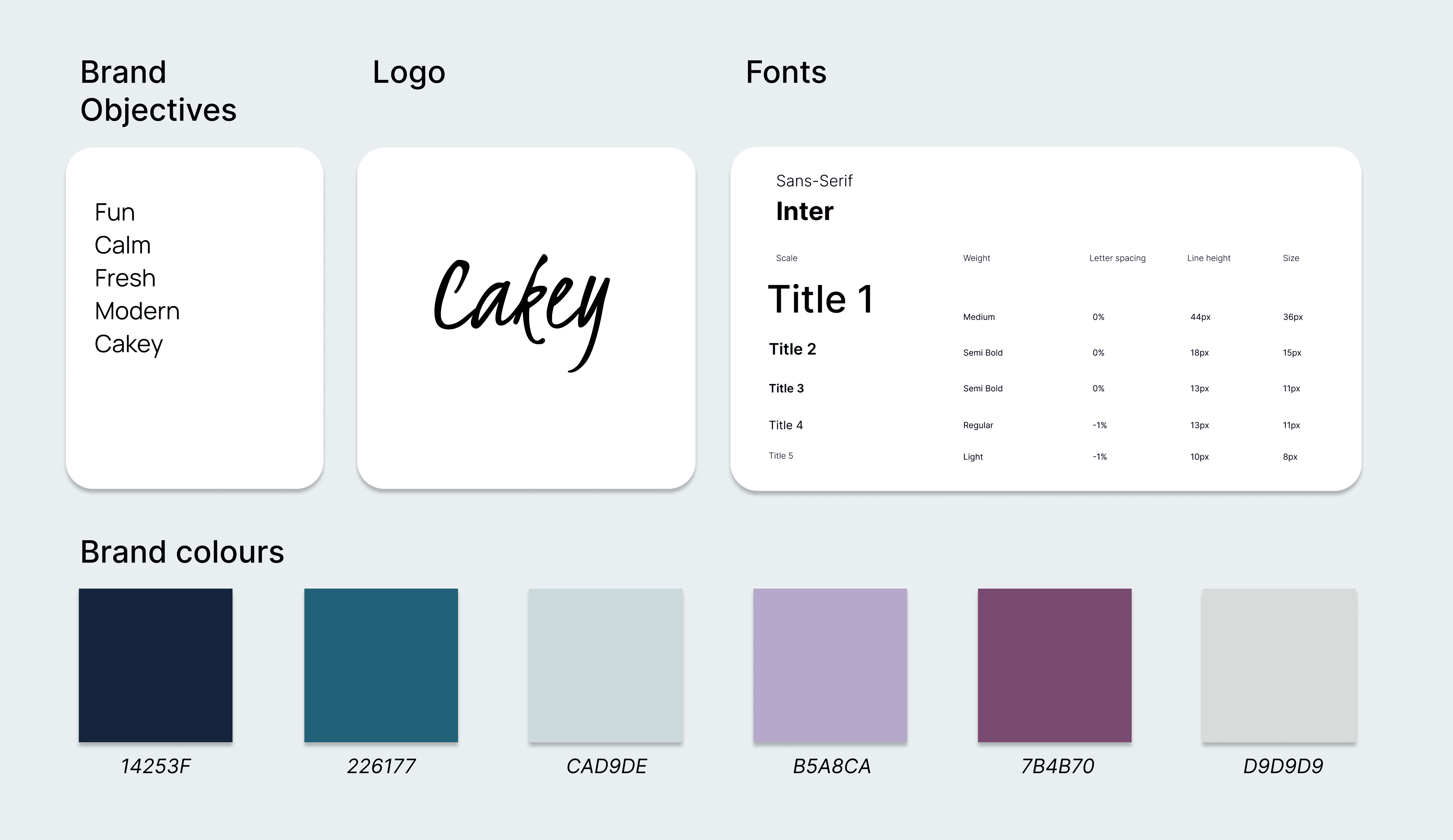
The initially chosen colors were difficult to read on the screen due to their brightness and lack of contrast with the background, failing to meet usability requirements.
The font selected was difficult to read as it was too small and needed enlargement for better accessibility.
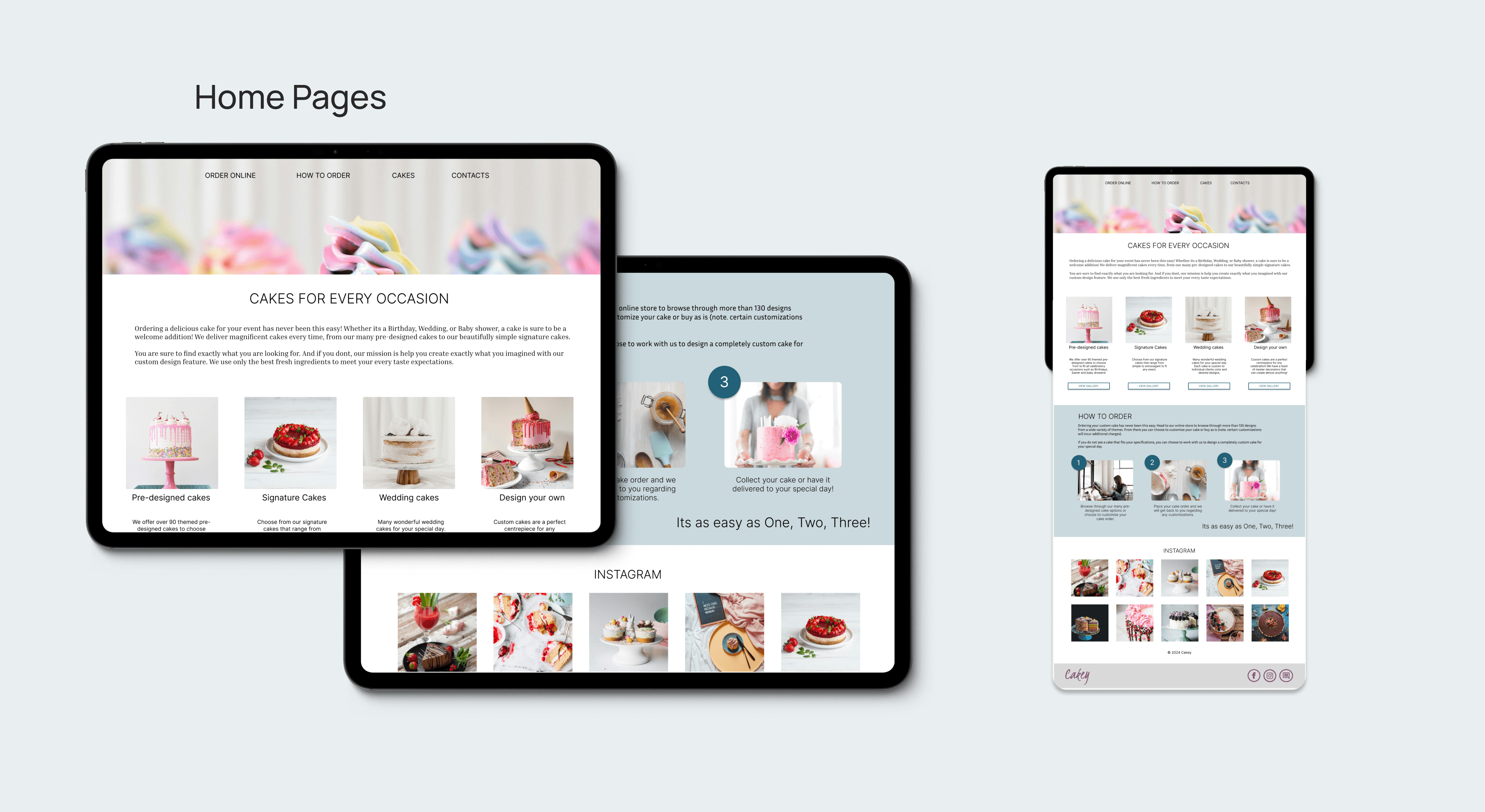
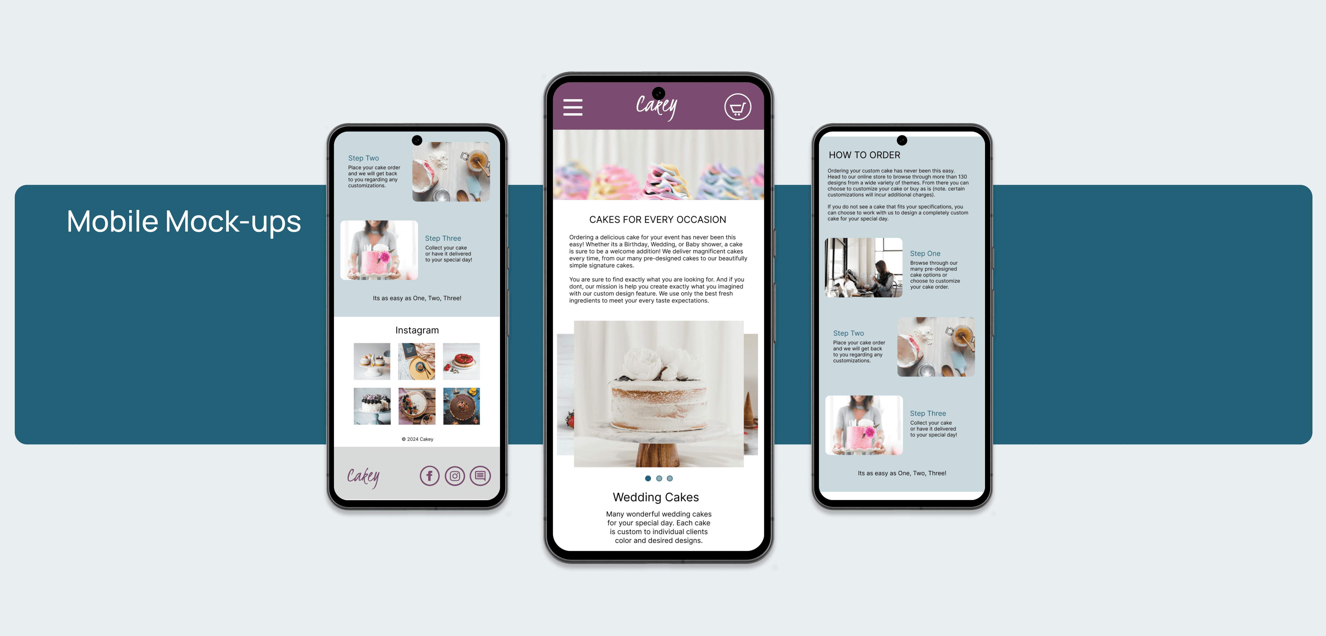
The buttons needed a change of color to stand out and a sizing revamp because they were too big and didn't match the design theme. I did research by looking at websites and successful UI kits to come up with better sizing.
Impact - Users were able to navigate through the website efficiently to reach the end goal (which was ordering a cake).
What was learned - I learned that small tweaks in a design can make all the difference in the look as well as the usability of the website. I also learned that many websites can help with things such as accessible colour choices and fonts, making the design process even a bit easier and more inclusive.
The next steps include preparing an in-depth presentation and documentation of the project to present to stakeholders detailing research findings, design rationale, user testing outcomes and the design process to receive feedback on the design and its usability. Conduct further user testing to see if any other issues can be further addressed.
This project was a testament to the importance of thorough user research and iterative design in creating solutions that truly meet user needs. It honed my skills in collaboration, problem-solving, and effective communication, setting a solid foundation for my future endeavours in UX/UI design.
