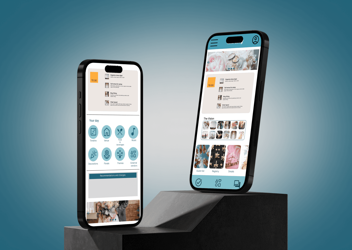
The Day is a website designed to directly link the couples who are planning a wedding with the people who will be making it all happen. Allowing direct communication with the wedding planners as well as the vendors, making it easier to plan wherever you are with ease and stay in the loop.
Role
UX/UI Designer
Industry
Wedding Planning
Duration
4 months
This project was conducted through the Google online UX course through Coursera. It was a random selection from a design problem generator.
Users need a convenient way to plan and communicate with wedding planners and vendors while also leading busy lives whereby they don't have free time during working hours.
Design an app that allows users to easily plan their weddings anytime with the help of a wedding planner.
My responsibilities were user research, conducting interviews, synthesizing information, creating mockups and wireframing, creating low and high-fidelity prototypes, accounting for accessibility, and iterating on the designs.
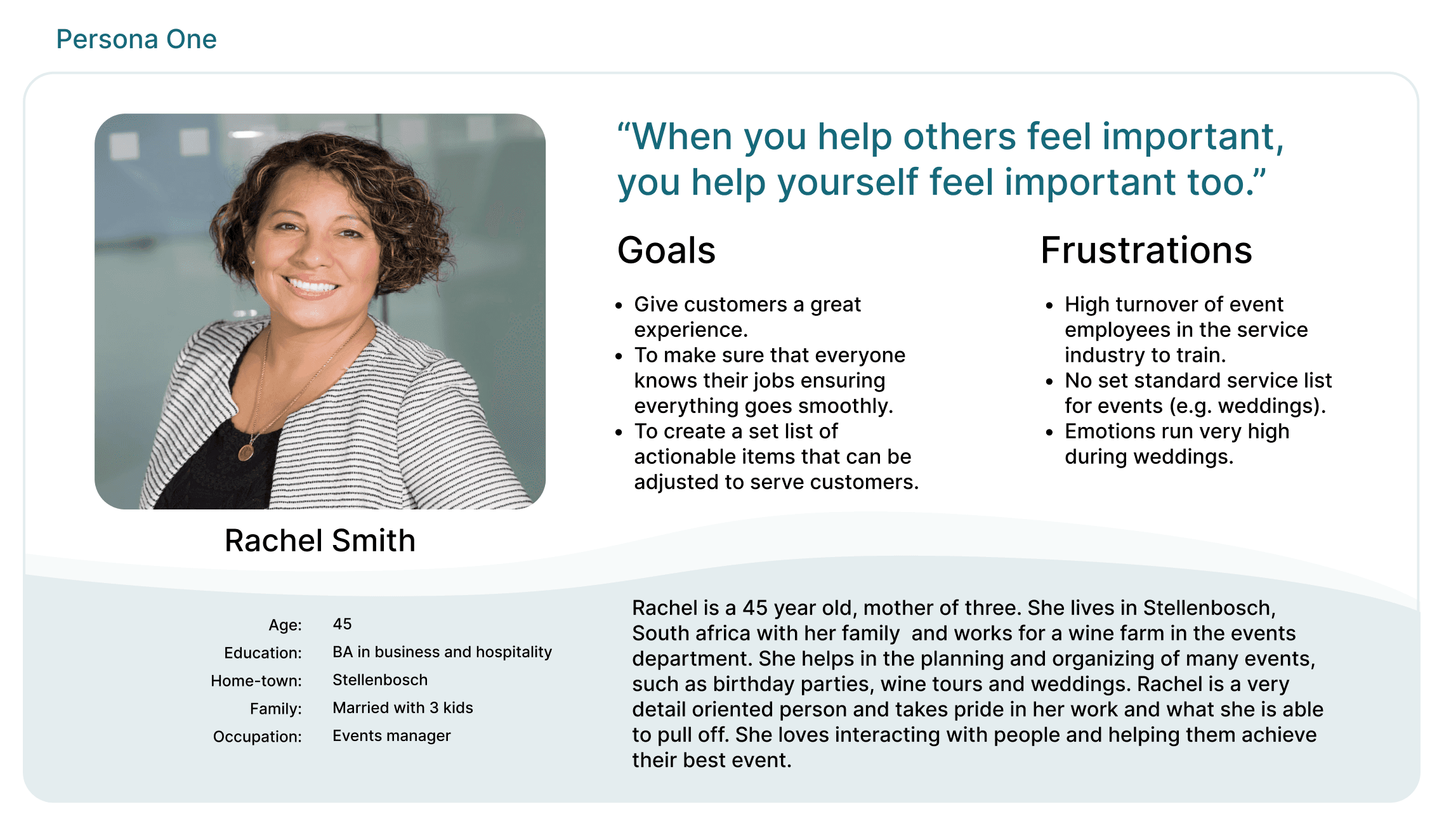
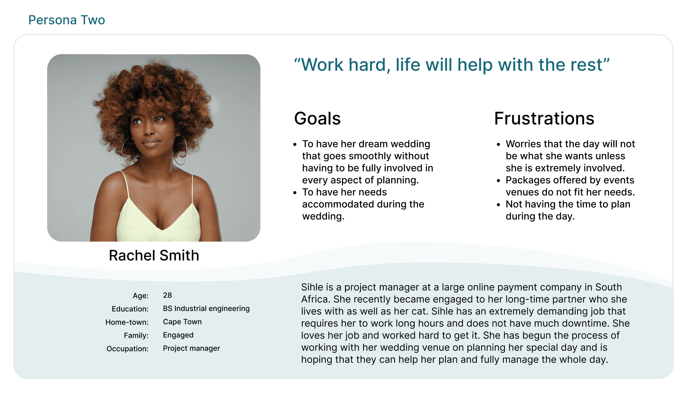
I conducted interviews, created empathy maps and conducted a competitor research analysis in order to define my user base, their needs as well as the products that are already available to my users. The primary users that were identified where men and women between the ages of 21 and 40 who are planning a wedding. We also found another set of users on the back end of the app, these being men and women who are wedding planners at wedding venues who would be assisting in the wedding planning process.
The user group confirmed the initial assumptions made about what a wedding planning app needed in order meet the needs of the user group. The research also showed that in the fast paced world, the role of planning becomes harder to manage. People want to be involved in the planning element of their wedding however, they also want to work with wedding planners and venues in their own time (something that is often times not possible if you work full time). Research also showed that people wanted to to be able to access their vendors, guest lists as well as have their registry all in one place.
I created a storyboard in order to walk through the path that the potential users of this app will go through while using it. This storyboard highlighted key pain points and areas of improvement.
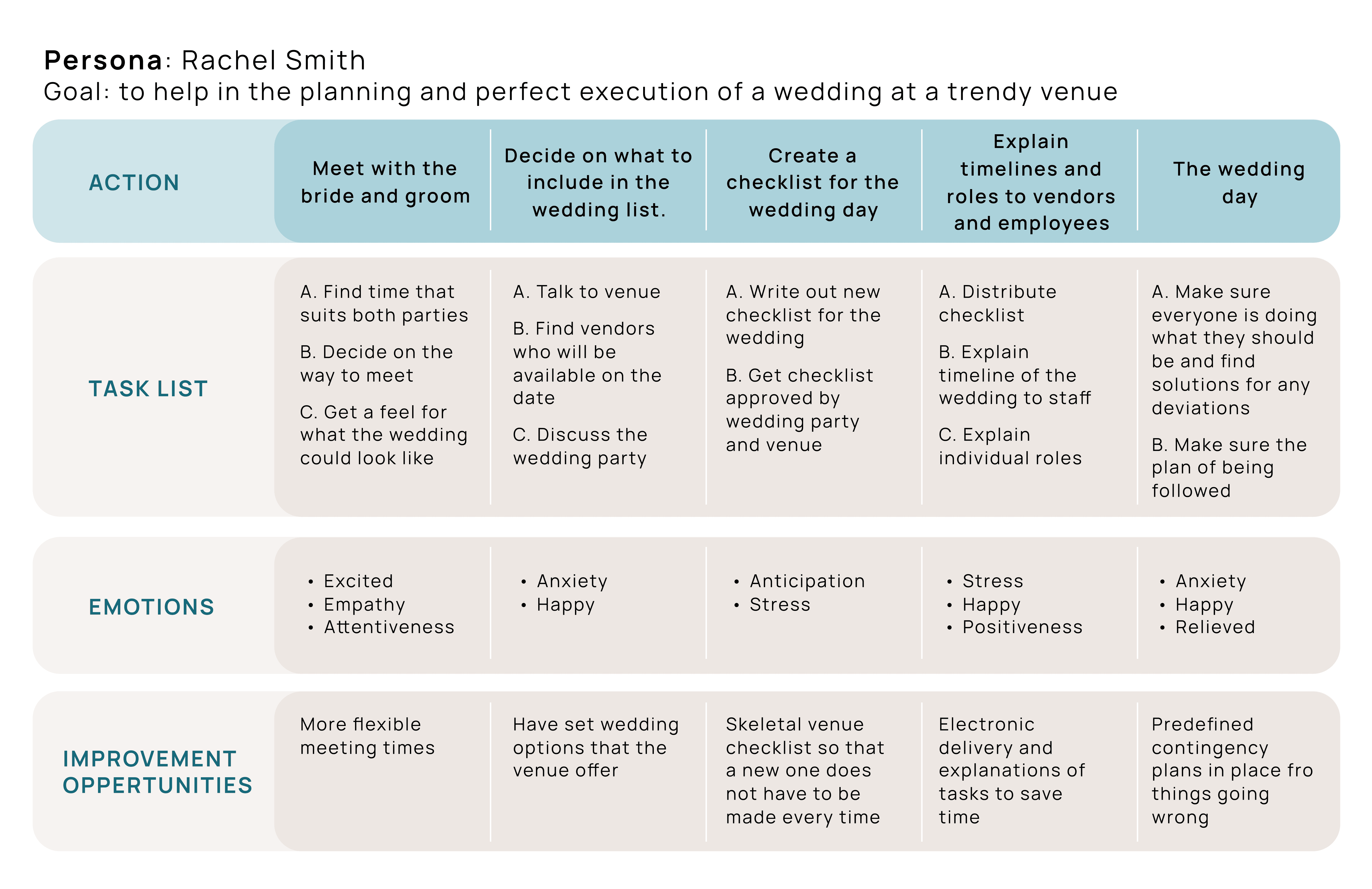
Conducting a user journey map helped identify the steps that Rachel took to organize and meet with a potential user for a wedding app. It helped pinpoint the steps that could be avoided to make the process seamless for users.
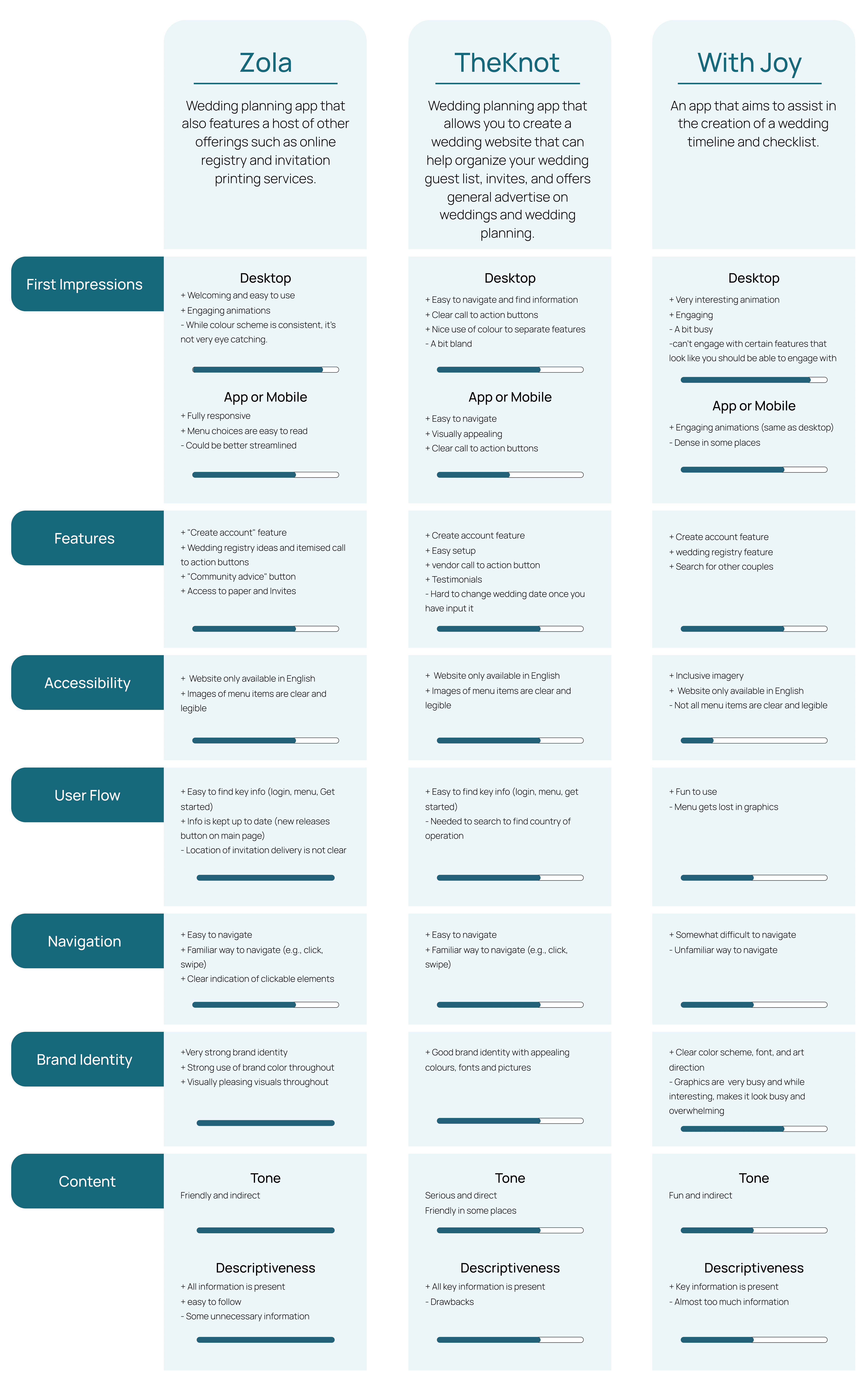
This competitive audit aims to identify direct and Indirect competitors for a wedding list app, and to determine successes and pain points in which to improve upon in the wedding list design.
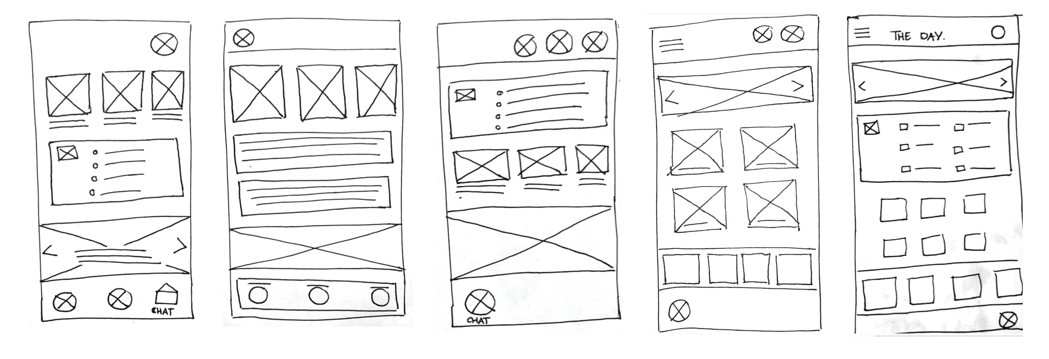
By creating paper wireframes, I was able to quickly and efficiently figure out general layouts for the app development. I played around with a couple of home page layouts before deciding on one that I would take forward into the digital wireframes.
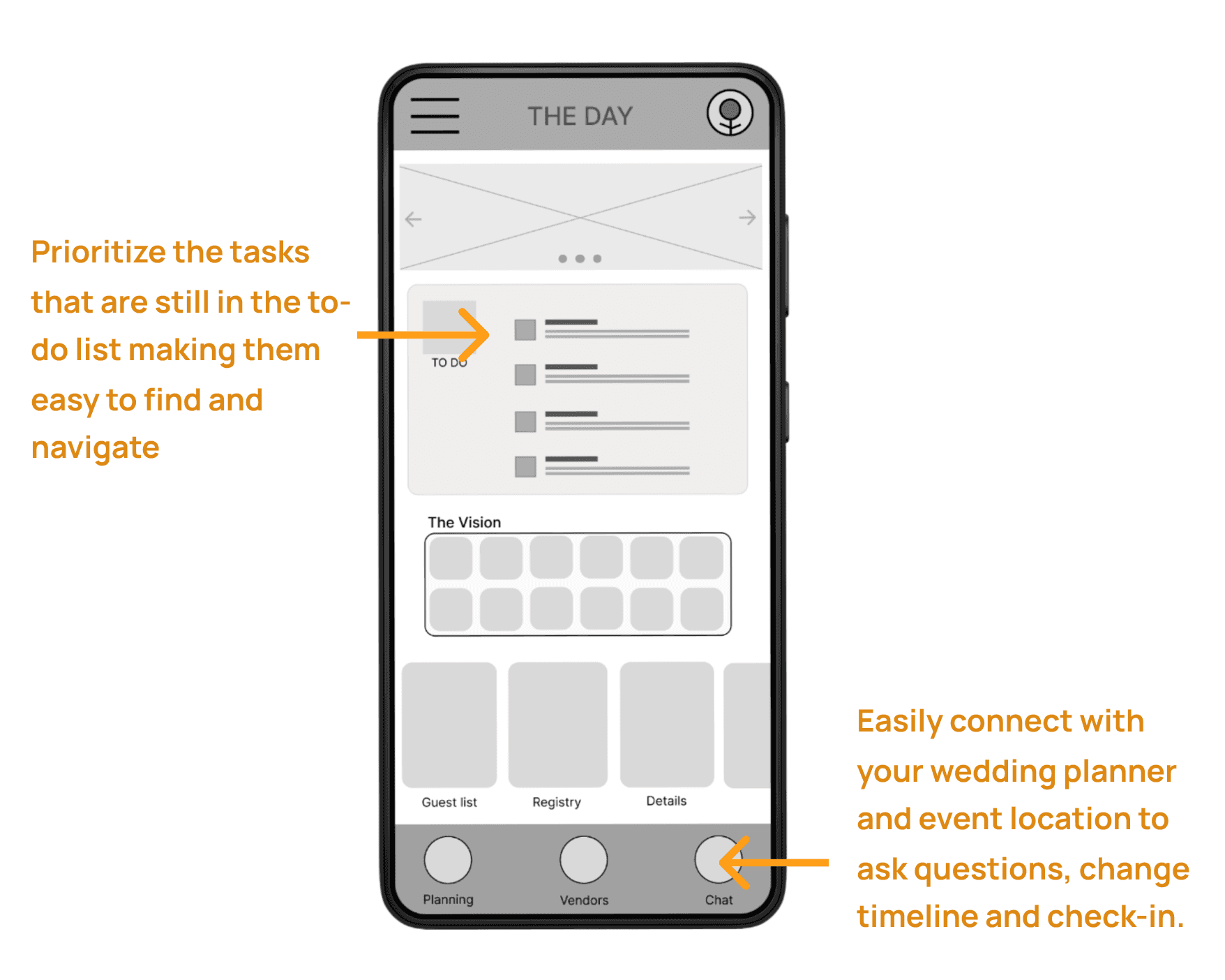
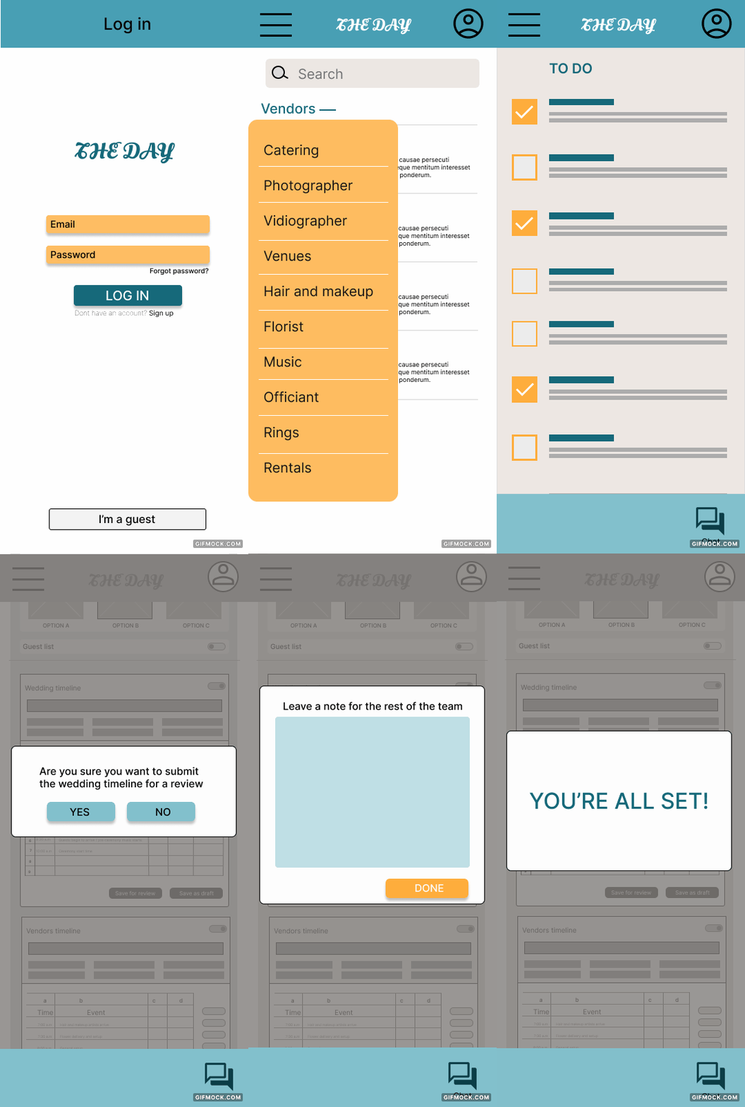
The low fidelity prototype outlined the general locations of the wedding planner app. Connecting the primary user flow to the secondary functions. This prototype could then be used for usability testing.
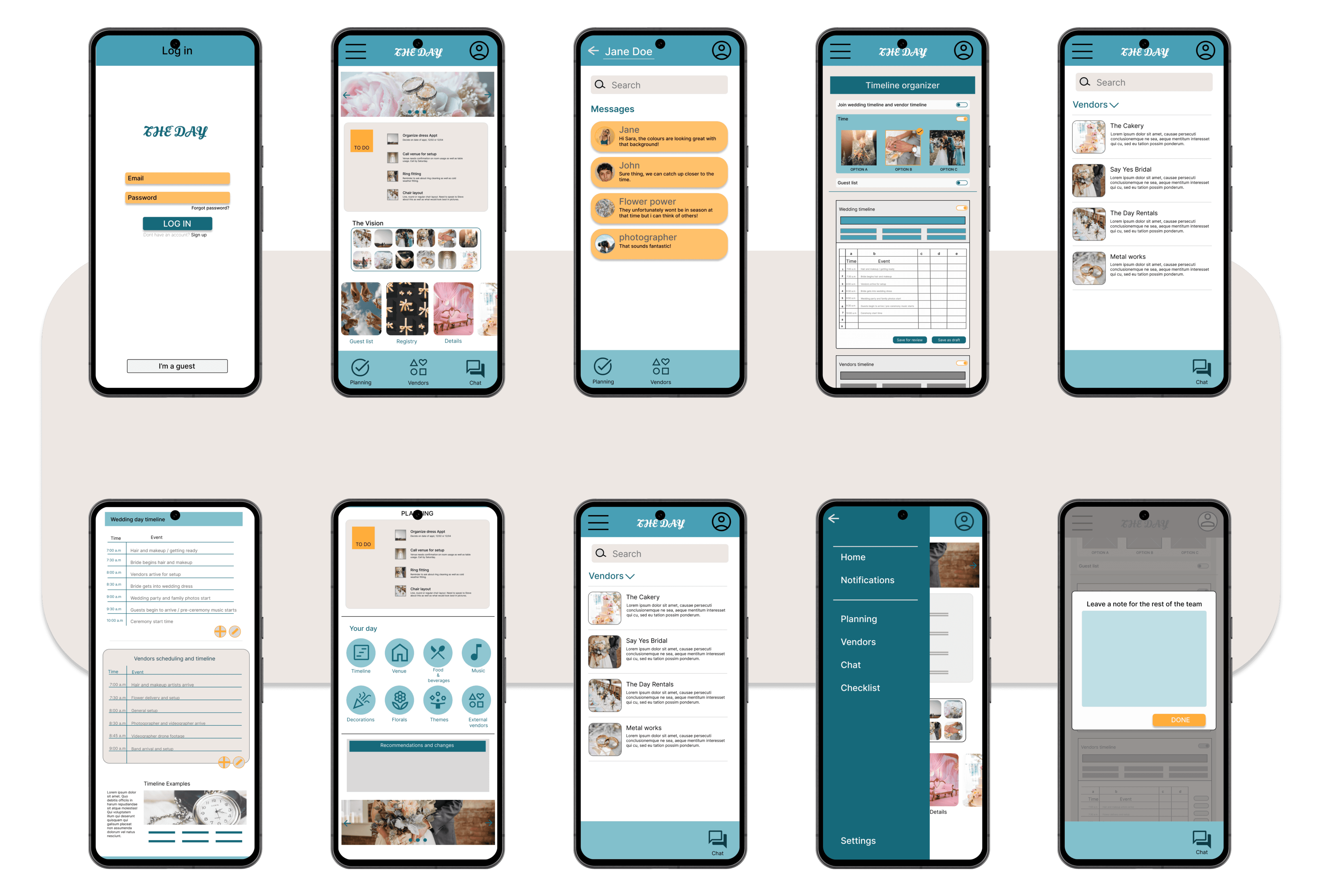
The app prioritizes the tasks that are still needing to be done making sure that you never fall behind. There is also a quick chat button on every screen to communicate with the wedding planner about any process of the wedding planning or changes that you may want to make.
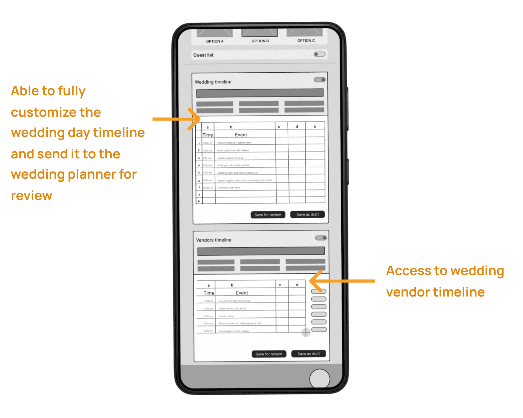
Easily organize the wedding day timeline both for the wedding party as well as for the vendors. Once a change is made you can send this change to your wedding planner and venue for review. hhhhhhhhhhhhhhhhhhhhhhhhhhhhhhhhhhhhhhhhhhhhhhhhhhhhhhhhhhhhhhhhhhhhhhhhhh
By creating paper wireframes, I was able to quickly and efficiently figure out general layouts for the app development. I played around with a couple of home page layouts before deciding on one that I would take forward into the digital wireframes.
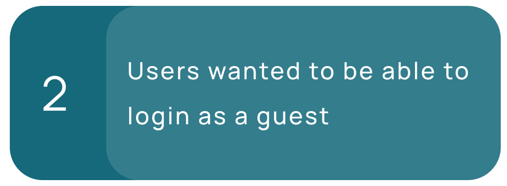
The usability studies revealed that a vital function had been left out of the original design. As this app features a function to view the wedding registry, It would be wise to be able to access the app without creating an account so that people who are attending the wedding have easier accessibility to these functions. For this reason, an “I’m a guest” button was added for non app users.
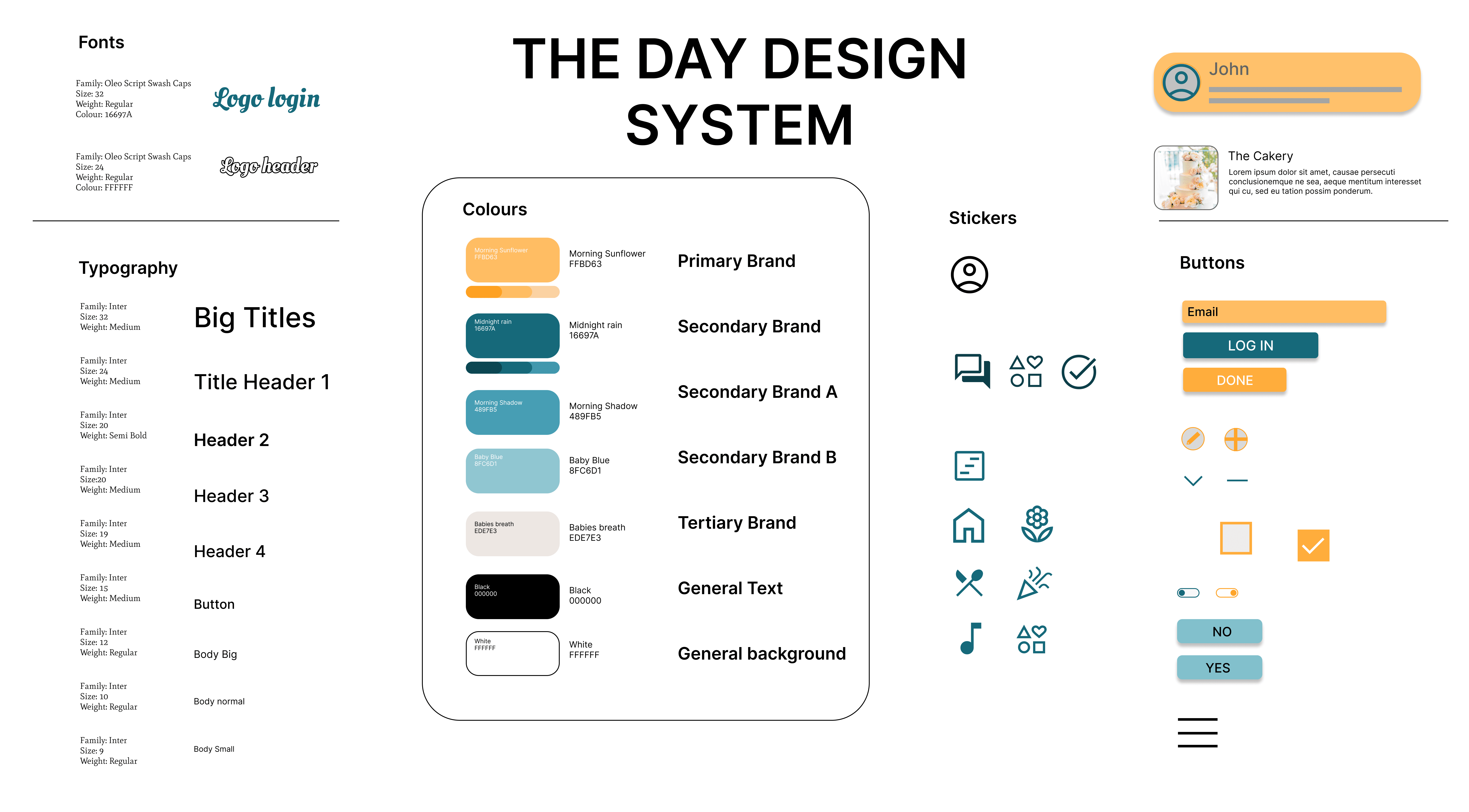
The Primary brand colour that was initially chosen did not pass the accessibility test with potentially users. It was too light and became almost illegible on certain backgrounds.
The colour was then swapped out for a darker version of the that colour to improves the accessibility of the app.
This app has had a big input on brides and grooms who are planning weddings in this very fast paced world. Allowing them to create their dream wedding, in lifes in between moments.
-Conduct more user testing to see if there are any other issues that can be further addressed.
-Conduct another round of usability testing to establish if all of the issues have been addressed accurately.
-Meet with stakeholders to show progress and receive feedback.
While designing the Day wedding planner app I learned that there are many ways to get to a solution. It's all about iteration and user testing until you come up with what people really need.
